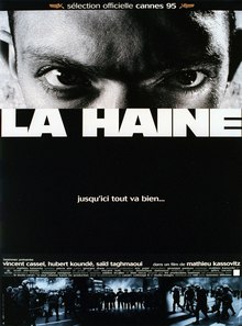
'After local youth Abdel is beaten unconscious by police, a riot ensues on his estate during which a policeman loses his gun. The gun is found by Vinz who threatens he will kill a cop if Abdel dies'.
 'La Haine' is a French black and white drama/suspense film directed, co-edited and written by Mathieu Kassovitz in 1995. The film was inspired by events in the French suburbs in 1993, when the young Zairian, Makome M’Bowole, was shot. He was killed whilst in police custody and was handcuffed to a radiator. An officer had been threatening him due to being offended and angered by the young Frenchman's words and it was reported that the gun went off accidentally.
The film is all about 'La Haine', translated into English as 'Hate', which is portrayed through the characters attitudes, their surroundings and the story line.
The beginning titles of the film set a good foundation for what was to unfold; footage of burning cars and people fighting fill the screen while an over-voice of news footage struggles to be heard amidst the cacophony of sound. The entire film has a documentary type feel - almost as if it were a cameraman following a news correspondent through a war zone. Most - if not all - of the shots were filmed using the handheld shooting technique, which means no tripods were used to steady the shot. A number of films have been made using this method including 'The Blair Witch Project' and 'Cloverfield'. The use of black and white rather than colour is in itself a metaphor. Its inumerous shades of grey encompasses every aspect portrayed and expands and challenges ideals in this unrivaled, multifaceted, intense drama. The editing was different from any film I'd seen before. There were several moments of creative cinematography that contrasted with the violent events that were occurring. These acted as an artistic respite. The most noticeable of these was the scene where the three main characters were standing on top of a balcony and the push-pull/dolly zoom technique was used. This section of film was sandwiched between the ticking clock inserts. As the story documents a period of 19 hours, intermittently the film stops abruptly and a ticking clock is seen and heard - presenting the aspect of time to the viewer. I did not personally like this as I felt as if I were being pulled out of the film, just as I was starting to get into it. Although at times the film became quite confusing, and some parts were seemingly irrelevant to the plot, I think that somehow the audience was given an opportunity to reflect on what was happening.
The director's insight into the events that took place (and were still taking place at the time of filming) really impacted the film. His way of interpreting the events, and projecting raw emotion enabled the viewer to relate to the full weight of the situation. However, in truth, the characters are not likable, and the story line itself is depressing. The harsh brutality of reality demands a reaction from all viewers; either for them to deal with the realisation of the depravity of the human condition which in turn evokes feelings of hatred or on the contrary a yielding to show pity. I imagine the Director would be satisfied with one or the other conclusively, therefore achieving his objective.
See here for the Official Trailer: http://www.youtube.com/watch?v=yk77VrkxL88
'The film is dedicated to those who died whilst it was being made'.

Comments
Post a Comment