
Adobe Photoshop - Painting

Photoshop is a brilliant piece of software. Anything from editing images, creating posters and drawing deisgns - it will do the job. 

Some say that one cannot truly learn something without putting the skill into practise and experimenting individually. It takes up to 10,000 hours to master just one thing, and when it comes to technology it is definetly true! Softwares are forever being upgraded and technology is always advancing.

In essence, Adobe Photoshop is relatively simple to use, but when one has a desired look in mind it is often due to experimentation and practise that the job is done.

In my spare time I have practised with the software and tried out different ideas, and , of course, not all of them have worked. However, one particular work I enjoyed was sketching and painting something from scratch. It is not easy with a mouse, and even less so with a touchpad.

It starts with a basic outline using a pen/pencil with the opacity set to 50 or less. When this is done the skin layer is added, and the different shades are blended together using the blur tool. After this the detail can be added such as the facial features and clothes/accessories. More than often I found myself having to reposition certain aspects such as the eyes.

This was the first attempt:


(Lady Mary  Crawley - Downton Abbey)

And this was the second attempt, which, having had a little more practise, is much more detailed compared to the first:
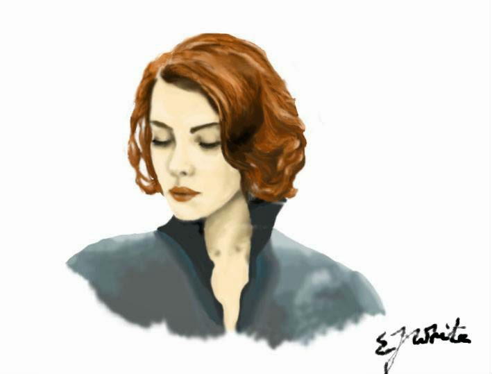
 (Black Widow - The Avengers Assemble)

Comments

Popular posts from this blog

The Hobbit - Defining the Look

A look into the use of lighting and colour to create emotion. Originally published in 1937, The Hobbit was written by J. R. R. Tolkien. It has since been made into a Trilogy by the film director Peter Jackson consisting of: The Unexpected Journey The Desolation of Smaug The Battle of the Five Armies What is most notable about these films is that they are very different to the Lord of the Rings Trilogy. Although set in the same universe of Middle Earth, there is a tangible contrast between them.  The Hobbit, some might say, is lighter, funnier and more suitable for children when compared with The Lord of the Rings. This being said, J. R. R. Tolkien did write the book for children and it was aimed at young readers around the ages of 9 and 10. One difference, for example, is the use of lighting and colour - which is used as a n extension of a particular character -  to provoke an emotional response from the audience. In general, the film is brightly lit,...

STORYBOARDING: The Chess Player

A few months ago I was presented with the opportunity to create the storyboards for a student project at the University I had graduated from. Having always storyboarded my own projects, and used to drawing what I could see inside my own mind, I jumped at the chance to help visualise someone else's film. Everybody sees things differently. We imagine, we visualise in different ways. Maybe because our brains are wired differently, maybe because we all rely on different experiences or the things we've read. A wide shot to one person might be a close to another; or someone might prefer a high-angled birds eye view, whilst another a fish-eye lens effect. There are endless ways to visualise a story and we are all unique when it comes to this. So being tasked with aiding in the visualisation of someone else's film is by no means an easy feat. One must be able to see inside the director's mind, understand their vision and translate that into something that will reach and ...

Kid's & UFO's: Title Sequence

Testing and creating the title sequence: To achieve a childlike style many different drawing styles were looked at to see which would appeal most to children and young adults. The detailed ones were fascinating to look at, however placing too much detail into a stop motion animation would clutter the screen. Simpler drawings with black outlines - similar to the style of Rachel Ryle - were more suited. Sketches were made and the colouring was tested. Felt-tip pens created too harsh a tone, whilst colouring crayons provided a softer layout that was pleasing to the eye. The title sequence for 'Kids and UFO's was made up of 147 different photographs. The basic idea was this: A girl in a rocket is launched into space from her back garden, flying past stars, planets, aliens and ufo's. The rocket then flies away to reveal the title of the film: 'Kids and UFOs'. Drawings were created on paper, coloured in using crayons and cut out. These were then placed on a col...