
Shirley Holmes and Joan Watson - Title Spoof

I make a lot of spoofs. Fact.

I love being able to take an idea, and then develop it and make it into something different; something unique. It is often true that there are no new ideas, that someone will have probably thought of it before you have, which is why it is important to be original - the idea may not be, but your approach to it can.

Sherlock is perhaps one of my most favourite TV series, and I love the opening titles. The editing and juxtaposition of the images is simply mind-blowing, the film accompanied by stop-motion animation and text.

You can watch it here: http://www.youtube.com/watch?v=1HsxGygknNE

I wanted to try and create my own version of the opening titles, with the idea that Sherlock becomes Shirley, and John becomes Joan (Shirley's cousin), even though the style is completely different. I didn't overlay images or use stop-motion in the film. In comparison, mine is relatively simple. I spent around 5 minutes figuring out what to film, and then went out and did it - a spur of the moment action. 

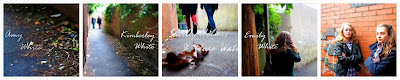
I used my little Canon Ixus to film with, but set it to the miniature effect - which means it films everything at 10 times the speed. I set it to minature because I like the vivid colours and the blurs around the edges. When it came to editing it was quite difficult as everything had to be slowed down by at least 25% which made the images a bit jumpy - although to be honest I think its quite effective. Some of the shots were filmed more than once - with wide angles and close ups. The feet shots were filmed with the camera upside down on the tripod so I could run with it - a little odd you might think, but it worked. Here are some still shots:


I edited the footage on Windows Movie Maker - the 2.6 version - which took around 45 minutes. The images are mostly cut on the beat of the music (which - DISCLAIMER - I do not own), the images flickering occassionally. The footage I took lasts approximatly three minutes altogether, which is more than enough to cover the 32 seconds of music. 

Fact: It is always important to take more footage than you need. More is always preferable to less.

The film was shot in just one location, so in that sense it is not as varied as it could have been. There could have been several locations, therefore allowing me to do more such as experimenting with juxtaposition and the like. All in all I am quite happy with how the film turned out. I could easily imagine it as the beginning to an episode, which - perhaps somewhere in the near future - I might just attempt to make.

Here is the finished video: https://vimeo.com/81215770

Comments

Popular posts from this blog

STORYBOARDING: The Chess Player

A few months ago I was presented with the opportunity to create the storyboards for a student project at the University I had graduated from. Having always storyboarded my own projects, and used to drawing what I could see inside my own mind, I jumped at the chance to help visualise someone else's film. Everybody sees things differently. We imagine, we visualise in different ways. Maybe because our brains are wired differently, maybe because we all rely on different experiences or the things we've read. A wide shot to one person might be a close to another; or someone might prefer a high-angled birds eye view, whilst another a fish-eye lens effect. There are endless ways to visualise a story and we are all unique when it comes to this. So being tasked with aiding in the visualisation of someone else's film is by no means an easy feat. One must be able to see inside the director's mind, understand their vision and translate that into something that will reach and ...

The Hobbit - Defining the Look

A look into the use of lighting and colour to create emotion. Originally published in 1937, The Hobbit was written by J. R. R. Tolkien. It has since been made into a Trilogy by the film director Peter Jackson consisting of: The Unexpected Journey The Desolation of Smaug The Battle of the Five Armies What is most notable about these films is that they are very different to the Lord of the Rings Trilogy. Although set in the same universe of Middle Earth, there is a tangible contrast between them.  The Hobbit, some might say, is lighter, funnier and more suitable for children when compared with The Lord of the Rings. This being said, J. R. R. Tolkien did write the book for children and it was aimed at young readers around the ages of 9 and 10. One difference, for example, is the use of lighting and colour - which is used as a n extension of a particular character -  to provoke an emotional response from the audience. In general, the film is brightly lit,...

Kid's & UFO's: Title Sequence

Testing and creating the title sequence: To achieve a childlike style many different drawing styles were looked at to see which would appeal most to children and young adults. The detailed ones were fascinating to look at, however placing too much detail into a stop motion animation would clutter the screen. Simpler drawings with black outlines - similar to the style of Rachel Ryle - were more suited. Sketches were made and the colouring was tested. Felt-tip pens created too harsh a tone, whilst colouring crayons provided a softer layout that was pleasing to the eye. The title sequence for 'Kids and UFO's was made up of 147 different photographs. The basic idea was this: A girl in a rocket is launched into space from her back garden, flying past stars, planets, aliens and ufo's. The rocket then flies away to reveal the title of the film: 'Kids and UFOs'. Drawings were created on paper, coloured in using crayons and cut out. These were then placed on a col...