
Montage

There are several different interpretations of the word 'montage':
  • A single pictorial composition made by juxtaposing or superimposing many pictures or designs.
  • A relatively rapid succession of different shots in a movie.
  • The juxtaposition of such successive shots as a cinematic technique.
  • The technique of selecting, editing, and piecing together separate sections of film to form a continuous whole.
People have certain views on what a montage actually is. Some say that it must compress time, others that it must show a lot of information within a short period. Here a a few examples:
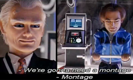
  • Team America - Montage: Team America
    • This montage is used to show the passing of time, compressing the time period into a few minutes.
  • Ghostbusters: http://www.youtube.com/watch?v=oT6haE_NalE
    • This montage speeds up the story line and only gives necessary information, which is told through newsreel clippings and headlines. The time period is also revealed through dates, and shots of intercutting characters at different times of day.
  • DagDraumer - http://www.youtube.com/watch?v=hjwL--Dc0yA
    • This film intercuts different time frames to give the impression of skipping time. The camera follows the same person, cutting from day to day, from location to location (this is known as a match cut).
  • Adam Curtis - It felt like a kiss - http://vimeo.com/22589118
    • This video depicts an event. There are combinations of different shots, some relevant, some seemingly not (Juxtaposition). The text and images are used to convey an idea, and can also be seen in different contexts, depending on the viewers interpretation. The events is compressed into a smaller time period, almost like a virtual recap.
So you see, a 'Montage' can be represented in different forms. It is whatever you want it to be.

Comments

Popular posts from this blog

The Hobbit - Defining the Look

A look into the use of lighting and colour to create emotion. Originally published in 1937, The Hobbit was written by J. R. R. Tolkien. It has since been made into a Trilogy by the film director Peter Jackson consisting of: The Unexpected Journey The Desolation of Smaug The Battle of the Five Armies What is most notable about these films is that they are very different to the Lord of the Rings Trilogy. Although set in the same universe of Middle Earth, there is a tangible contrast between them.  The Hobbit, some might say, is lighter, funnier and more suitable for children when compared with The Lord of the Rings. This being said, J. R. R. Tolkien did write the book for children and it was aimed at young readers around the ages of 9 and 10. One difference, for example, is the use of lighting and colour - which is used as a n extension of a particular character -  to provoke an emotional response from the audience. In general, the film is brightly lit,...

STORYBOARDING: The Chess Player

A few months ago I was presented with the opportunity to create the storyboards for a student project at the University I had graduated from. Having always storyboarded my own projects, and used to drawing what I could see inside my own mind, I jumped at the chance to help visualise someone else's film. Everybody sees things differently. We imagine, we visualise in different ways. Maybe because our brains are wired differently, maybe because we all rely on different experiences or the things we've read. A wide shot to one person might be a close to another; or someone might prefer a high-angled birds eye view, whilst another a fish-eye lens effect. There are endless ways to visualise a story and we are all unique when it comes to this. So being tasked with aiding in the visualisation of someone else's film is by no means an easy feat. One must be able to see inside the director's mind, understand their vision and translate that into something that will reach and ...

Kid's & UFO's: Title Sequence

Testing and creating the title sequence: To achieve a childlike style many different drawing styles were looked at to see which would appeal most to children and young adults. The detailed ones were fascinating to look at, however placing too much detail into a stop motion animation would clutter the screen. Simpler drawings with black outlines - similar to the style of Rachel Ryle - were more suited. Sketches were made and the colouring was tested. Felt-tip pens created too harsh a tone, whilst colouring crayons provided a softer layout that was pleasing to the eye. The title sequence for 'Kids and UFO's was made up of 147 different photographs. The basic idea was this: A girl in a rocket is launched into space from her back garden, flying past stars, planets, aliens and ufo's. The rocket then flies away to reveal the title of the film: 'Kids and UFOs'. Drawings were created on paper, coloured in using crayons and cut out. These were then placed on a col...