


A look into the use of lighting and colour to create emotion.
It has since been made into a Trilogy by the film director Peter Jackson consisting of:
- The Unexpected Journey
- The Desolation of Smaug
- The Battle of the Five Armies
What is most notable about these films is that they are very different to the Lord of the Rings Trilogy. Although set in the same universe of Middle Earth, there is a tangible contrast between them. The Hobbit, some might say, is lighter, funnier and more suitable for children when compared with The Lord of the Rings. This being said, J. R. R. Tolkien did write the book for children and it was aimed at young readers around the ages of 9 and 10.
One difference, for example, is the use of lighting and colour - which is used as an extension of a particular character - to provoke an emotional response from the audience.
One difference, for example, is the use of lighting and colour - which is used as an extension of a particular character - to provoke an emotional response from the audience.
In general, the film is brightly lit, and, visually, light is used in contrast to the darker elements within the films in order to represent the running theme of hope. Darker scenes, from a lighting point of view, are specifically used for the literal dark characters - such as Orcs and Wargs etc...


It could also be said that the colouration of the film changes depending on the character to create a specific emotion or atmosphere. For the dramatic, danger-approaching, dark-and-evil sort of scenes, the tonal colouration used concentrates on mainly blues and greys. Deep, dark shadows are created in contrast to bright, highlighted or over-exposed areas such as the sky. (See above).

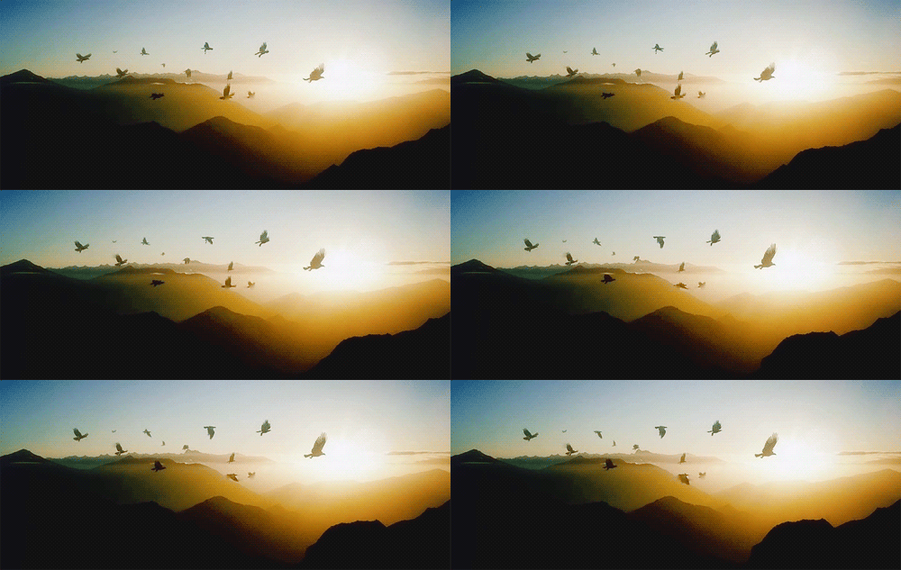
 Locations that are deemed 'good' or used in the more peaceful and happy scenes are therefore the complete opposite. Hobbiton and Dale (that is before it was destroyed) are very brightly lit and contain a wide spectrum of colours that linger on warm rather than cool tones. The temperature of these tones reflects on the mood of the image greatly.
 In general, the film is quite contrasty in the sense that the shadows are vivid against the highlights; the colours are over saturated and, where appropriate, have a romanticised viewpoint.
Even in the darker scenes, there is a level of fantasy that does not inflect a realistic atmosphere. These scenes also appear desaturated, and use very few warm tones. Although the images are dark, there is a stark contrast to how the darkness is represented. For example, today's fantasy stories are very dark in comparison and there is a level of darkness that they cross where it becomes disturbing, instead of remaining a fantasy; it becomes all too real.
Whilst The Hobbit is dark in places, there is a certain boundary that the filmmakers do not cross in order to retain the film's childlike quality. Perhaps this is why the use of lighting and tonal values are so incredibly important.

Comments
Post a Comment